As an e-commerce company, you would never want your buyers to get turned off by the website design or the navigation issues. There are two scenarios that mar the popularity of an e-commerce websites either the look and feel of the website is not appealing or the navigation of the website is faulty. In order to offer an unmatched user experience, it is imperative that the users are afforded with an e-commerce portal which is not only high on aesthetic appeal but also lets the users find the desired product with ease.
There are lots of design aspects that need to be worked on to accomplish a website that has the users hooked on to it. Moreover, the design has to be different for different pages. The links, labels, promotions and offers must be strategically placed and must never be stuffed in a single page. The most important page of any e-commerce website is the homepage and it must be given due importance while designing. If you are not able to embed eCommerce website usability, you are bound to perish in the intense competition in the market.
Pointers to enhance eCommerce website usability
- Home Page: Home page is the most crucial part of the e-commerce website and you must make the most of it. Some points that you must incorporate into the homepage design are lesser texts, absence of sliders, representation of the core offering with images etc. Simple navigation should be there to facilitate the users to search their product with ease.
- Product Category Page: The use of mega menus and bread crumbs in product category pages enhances the eCommerce website usability and the users are able to find their products without getting lost in the conundrum of categories. The products must be categorized wisely to ensure that the users are not turned off by the confusing lists. Add to cart button must not be conspicuous but a clear message should be displayed when the product is added to the cart.
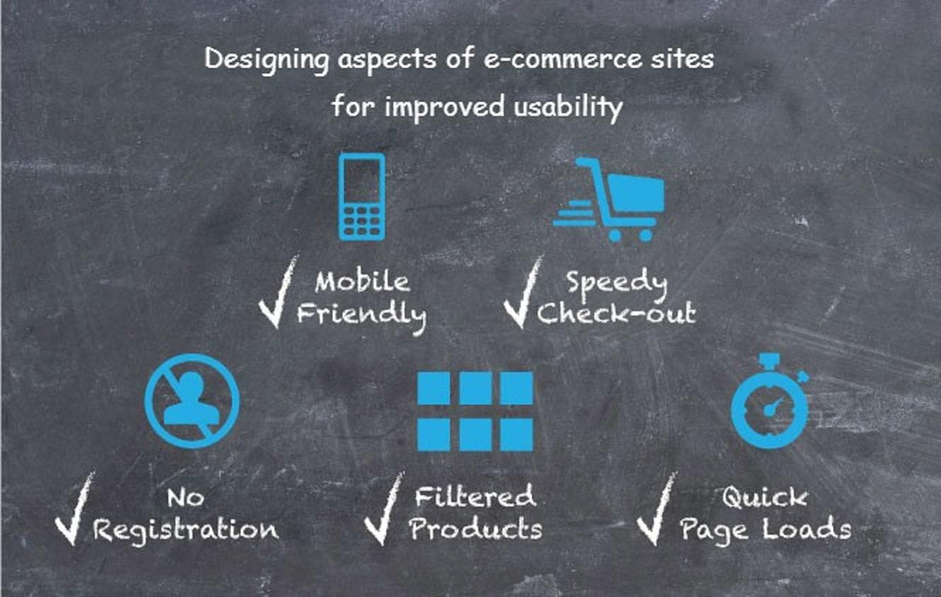
- Filters: Filter is the easiest way to narrow down the list of product based on the parameters like price, color, fit and other specifications. You must avoid the subjective filtering options as they create confusion which can prompt a user to abandon the shopping on your website and look for your competitors.
- Cart Page: As the user reaches the cart page, it is almost certain that he or she was impressed by the website. You must not disappoint the user at this stage. A cart page has the options to change the size, quantity, etc.
- Registration and Checkout Page: Rather than forcing the users to register themselves, they should be told the benefits of a user account. However, they must be allowed to shop as a guest. The Checkout page must be free from clutters and must clearly inform the users about the delivery time and the final amount.
To ensure that your e-commerce website usability is high, it has to simplify the buying process and make the user reach the checkout page in the simplest, quickest and the most effective manner. These design aspects if followed, can help you win over your rivals and reduce the bounce rate to minimum.
Contact Us To Hire E-Commerce Developer


